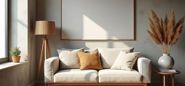
What trends will truly decorate interiors in 2026, and on what criteria can we measure the gap between a choice of color, material, or style? Trendy interior decoration is not just about accumulating tips: it relies on palettes identified by manufacturers, materials with comparable properties, and style choices that alter the perception of a space. This article compares concrete options to enhance your interior with original and cohesive decor.
Colors of the Year 2026: What Manufacturers Have Actually Chosen
The 2026 color charts are not a product of chance. Two major manufacturers have published their selections, and the direction is clear: a return to deep natural shades and enveloping neutrals.
| Manufacturer | Color of the Year 2026 | Reference | Color Family |
|---|---|---|---|
| Sico | Boreal Forest | 6167-83 | Deep forest green, palette of natural greens/browns/whites |
| Peintures MF | Plateau | 0704 | Enveloping warm neutral |
The choice of Sico with Boreal Forest 6167-83 confirms a shift towards nature-inspired greens, far from the cool grays that dominated a few seasons ago. This shade works well in both living rooms and bedrooms, provided it is paired with natural whites or refined browns from the same palette.
In contrast, Peintures MF with Plateau 0704 targets a different audience: those looking for a warm neutral that can adapt to any room without imposing a strong personality. The gap between these two proposals reflects two philosophies of interior decoration: asserting a character or creating a versatile backdrop.
For your interior, the choice between these two families depends on the size and natural light of the room. A deep green absorbs light and visually reduces space, while a warm neutral expands it. Before choosing, it’s worth discovering decor on Blog du Bricoleur to compare results based on room configurations.
Wallpaper and Natural Materials: Textures That Alter the Perception of a Space
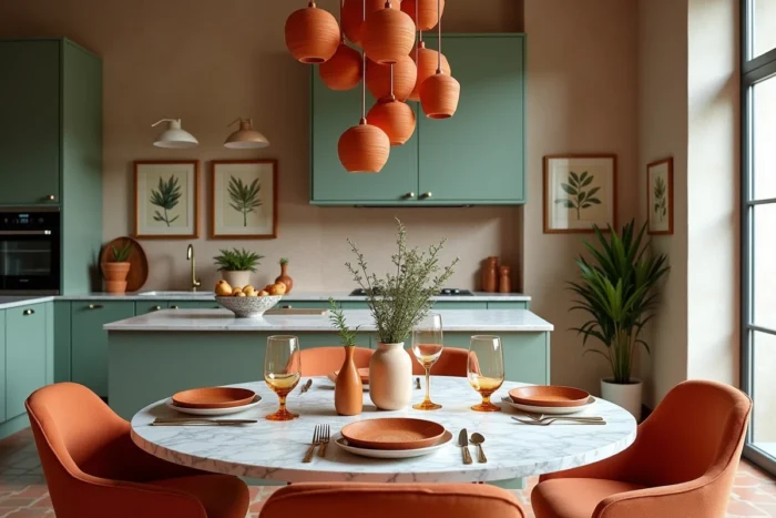
Color is not everything. The wallpapers of 2026 mark a rise in large-format botanical patterns and textures inspired by raw materials. It is no longer just a wall covering: it is a full-fledged design element that visually structures a room.
A single wall dressed in textured wallpaper is enough to transform a living room. A common mistake is to cover all four walls, which saturates the space and negates the desired depth effect. A panoramic strip on the main wall, paired with a solid color on the other three, creates a focal point without weighing down the decor.
Natural Materials in Furniture and Accessories
Raw wood, rattan, linen, and reconstituted stone dominate furniture collections. These materials share a characteristic: they visibly age, and that is precisely what makes them interesting in decor. A patinated solid wood piece adds a temporal dimension that a melamine piece will never replicate.
- Rattan is suitable for bright rooms (living room, veranda) but does not handle prolonged humidity well in a bathroom
- Linen for textiles (curtains, cushions, tablecloths) adds an irregular texture that breaks the monotony of smooth surfaces
- Reconstituted stone for countertops or backsplashes offers a mineral look without the weight or cost of natural stone
Combining a maximum of two natural materials per room avoids the “ethnic showroom” effect. Each material must have a specific function, not just a decorative role.
Interior Decoration Style: Compare Before Mixing
Mixing styles has become a reflex, but without a method, the result quickly turns into a mishmash. The table below compares three common approaches in interior decoration according to concrete criteria.
| Criterion | Minimalist | Japandi | Eclectic Maximalist |
|---|---|---|---|
| Number of decorative elements per room | 3-5 | 5-8 | 10+ |
| Color palette | Monochrome or bichrome | Neutrals + 1 natural accent | 4+ colors, mixed patterns |
| Type of furniture | Straight lines, few pieces | Sleek lines, light wood | Mismatched furniture, upcycled |
| Suitable for small spaces | Yes | Yes | Difficult without experience |
The Japandi style, which combines Scandinavian aesthetics and Japanese simplicity, works particularly well in medium-sized apartments. It tolerates a few decorative elements without requiring the radical minimalism of the minimalist style.
The eclectic maximalist style demands a true sense of composition. Without a dominant color rule (around 60% of the visible surface), objects compete instead of engaging in dialogue. This style succeeds when a hidden coherence is applied: a single family of warm tones, or a common material that connects furniture from different eras.
Lighting and Furniture Arrangement: The Two Underestimated Levers in Decor
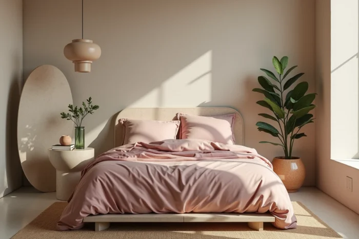
The majority of interiors suffer from a single central light source. A ceiling light alone flattens the volumes and removes the shadow contrasts that give relief to a room.
- Multiplying light sources (reading lamp, wall sconce, low-voltage garland) creates distinct zones within the same space
- Placing a light source at eye level (floor lamp, low-hanging pendant above a table) reduces the “waiting room” effect
- Warm temperature bulbs (below 3,000 kelvins) enhance the natural tones of walls and furniture
The arrangement of furniture alters the perception of a room more than their style. A sofa placed in the center of a living room, facing away from the entrance, creates a visual separation between the relaxation area and the passage zone, even without a partition.
Shifting a piece of furniture a few centimeters from the wall frees up visual breathing space. This detail, often overlooked, prevents the “furniture stuck to the walls” effect that shrinks rooms.
The decor trends of 2026 converge towards a simple principle: less superficial decoration, more choices of structuring materials and colors. The official palettes from manufacturers, natural textures, and well-distributed lighting do more than just accumulate decorative objects. The best investment often remains a well-chosen pot of paint and a well-placed lamp.